When you hear “Web Content Accessibility Guidelines,” do you know what that refers to? They’re a set of guidelines that websites — like the Jewish Federation of Ottawa — follow to fit with the Accessibility for Ontarians with Disability Act. We recently installed a widget on our website — www.jewishottawa.com — to ensure our compliance.
“The Jewish Federation of Ottawa is committed to offering services to persons with disabilities in ways that are consistent with the principles of dignity, independence, and inclusivity,” explains Pauline Colwin, Federation’s Director of Communications.
"And we are continuing to learn the best practices as we go. We hope the latest accessibility functions on the website make it more user-friendly," said Colwin adding that "it is Federation's core belief that everyone should feel welcome and be able to access their own meaningful Jewish journey."
For Jewish Disability Awareness and Inclusion Month, it is appropriate to highlight the various features this provides to website users and ensure everyone knows how to access these components.
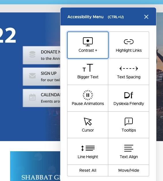
First, to find the accessibility options, look for the blue person icon in the bottom right corner of the screen. Clicking on this icon opens a menu of the following features:
Contrast:
There are four contrast options — invert colours, dark contrast, light contrast or desaturate (this one primarily makes the website appear in black and white). Colour contrast refers to the difference in light between font (or anything in the foreground) and its background. By using sufficiently contrasting colours, a website's font visibility becomes easier to distinguish.
Bigger Text:
There are four text size options. Even outside of accessibility options, it is recommended that text be at least 9 points in size as a default. Accessibility standards recommend this can then be zoomed in up to 200 per cent.
Pause Animations:
Moving images or features on websites can be jarring or confusing, especially if using a screen reader or consuming content at a slower pace. The pause/play animation feature stops the auto-scroll of the main banner image on the Federation website.
Cursor:
We have three cursor features. The cursor primarily refers to the mouse point triangle image. The Federation website has the option to make this mouse point larger, create a ‘reading mask’ or a ‘reading guide.’ The reading mask provides a small window of clear visibility and tints out everything else on the screen, to eliminate distractions. A reading guide is a straight line, used similarly to how one would use a rule to guide your reading in a printed book. Both tools can make it easier for people to read clearly.
Line Height:
The line height feature refers to the spacing within blocks of text, allowing you to increase the spacing if needed. The Federation website can go from the default line spacing to a 1.5, 1.75 and 2.0 spacing. Below you can see the default, followed by the 2.0 spacing.
Highlight Links:
Turning on the highlight links feature emphasizes all clickable links on the website. This makes links easy to find, preventing delays and speeding up access to desired content.
Text Spacing:
The Federation website has three text spacing options, in addition to the default, ranging from light to heavy spacing. While similar to line height, this is primarily for the spacing between each letter and word.
Dyslexia Friendly:
Turning on dyslexia friendly mode alters the font of the text on screen, to make it easier for those with dyslexia to consume content. This also includes changing certain letters — like N — to capital letters.
Tooltips:
Tooltips shows alternative text and aria labels for on-screen elements with a simple mouse hover. Tooltips are prominent, high contrast, and easy to read for low-vision users with accessibility needs.
Text Align:
This allows the use to align site text left, right or centre to ensure a personalized and more accessible reading experience.
By making websites accessible, organizations ensure that all of their potential users, including people with disabilities, have a decent user experience and are able to easily access information. By implementing accessibility best practices, organizations are also improving the usability of the site for all users.